Toggle Nav
The Role of Branding in Real Estate: Creating a Cohesive Look with Your Visiting Card

The Role of Branding in Real Estate: Creating a Cohesive Look with Your Visiting Card

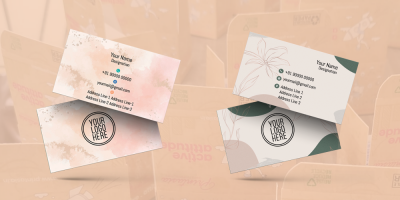
In the world of real estate, where the market is highly competitive and first impressions matter greatly, establishing a strong and recognizable brand image is crucial. Your real estate branding isn't just about a logo or a tagline; it's about creating a cohesive look and feel that represents your professionalism, trustworthiness, and the unique value you bring to your clients. One of the key elements of this branding effort is your visiting card. In this blog, we'll delve into the role of branding in real estate and how to create a cohesive look with your visiting card that will leave a lasting impression.
The Importance of Real Estate Branding
Branding in real estate is about more than just creating a recognizable logo or a catchy tagline. It's the process of defining your identity and communicating it consistently across all aspects of your business. Here's why real estate branding is crucial:
- Differentiation: The real estate market is saturated with agents and agencies. A strong brand helps you stand out and tells clients why you're the right choice.
- Trust and Credibility: A cohesive brand image conveys professionalism and trustworthiness. Clients are more likely to choose an agent or agency with a well-defined brand.
- Memorability: A strong brand is memorable. Clients are more likely to remember you and recommend you to others when your brand is consistent and recognizable.
- Customer Loyalty: A solid brand fosters loyalty among clients. When they have a positive and consistent experience with your brand, they are more likely to return and refer others.
- Attracting the Right Clients: Your brand can also help attract the type of clients you want to work with. If your brand communicates your values and specialties, it will resonate with the right audience.
Cohesive Real Estate Branding: The Visiting Card Connection
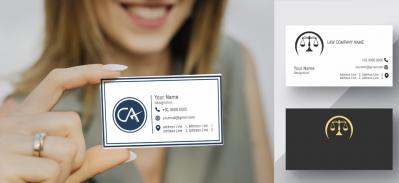
Your visiting card is a tangible representation of your real estate brand. It's often the first point of physical contact between you and a potential client, and it sets the tone for your relationship. To create a cohesive brand image with your visiting card, consider the following key elements:
- Consistent Color Palette: Choose a color palette that is reflective of your brand and consistently use these colors in your visiting card design. Consistency in color schemes helps reinforce brand recognition.
- Logo Usage: Incorporate your logo prominently and consistently. It should be the same logo that you use in your other branding materials. Ensure that the logo's colors and size are consistent.
- Typography Choices: Use consistent fonts and typography throughout your branding materials, including your visiting card. This ensures a professional and uniform look. Your typography should match the tone and personality of your brand.
- Tagline Inclusion: If your branding includes a tagline, incorporate it into your visiting card design. The tagline should succinctly express your brand's core values or unique selling proposition.
- Image Selection: If your brand incorporates specific images or imagery, use these same images or a similar style in your visiting card. This could be images of the types of properties you deal with or images that represent your brand values.
- Message and Tone: The tone of your messaging should align with your brand's personality. If your brand is known for its friendly and approachable style, ensure your visiting card's text reflects this tone.
- Quality Material and Printing: Choose a high-quality cardstock for your visiting card. This reflects the quality and professionalism associated with your brand. Invest in professional printing services to ensure consistency in color and image quality.
- Contact Information: Make sure your contact information is accurate and consistent. Your phone number, email, and address should match the details on your other brand materials.
- Branded Social Media Icons: If you use social media for branding and client engagement, include social media icons or links on your visiting card. Ensure that the icons match the visual style of your brand.
- Emphasize Specialties: If your real estate brand specializes in particular types of properties or markets, be sure to emphasize these on your visiting card. For example, if you focus on luxury homes, make this clear in your card design.


Case Study: Creating a Cohesive Real Estate Brand
To illustrate the power of cohesive branding in real estate, let's consider a case study.
Case Study: Luxury Estates Realty
Background: Luxury Estates Realty is a real estate agency specializing in high-end luxury properties in a major metropolitan area.
Brand Identity: Luxury Estates Realty has cultivated a brand image centered around sophistication, exclusivity, and impeccable service. Their logo consists of an elegant, minimalist design featuring the company name in sleek, modern typography.
Cohesive Branding: To maintain a cohesive brand image across all materials, Luxury Estates Realty adheres to a few key branding principles:
- Color Palette: The company's primary colors are deep navy blue and gold, which evoke a sense of luxury and elegance. These colors are consistently used in all branding materials, including the visiting cards.
- Typography: Luxury Estates Realty uses a classic serif font for all branding materials, from their website to brochures and visiting cards. This font exudes sophistication and timelessness.
- Logo Usage: The company's logo is prominently featured on the front of their visiting card. It's in the same colors and typography as on their website and other marketing materials, ensuring brand consistency.
- Imagery: The agency's website and brochures feature high-quality images of the luxurious properties they represent. Similar images, showcasing elegant interiors and exteriors, are used on the visiting card.
- Tagline: Luxury Estates Realty's tagline, "Exquisite Living Redefined," is consistently included on their visiting card. This succinctly conveys their dedication to offering exclusive, redefined living experiences.
- Quality Material and Printing: The visiting card is printed on high-quality, heavyweight cardstock, maintaining the luxurious feel associated with the brand. The printing quality ensures that the colors and images are crisp and consistent.
- Contact Information: The contact information on the visiting card matches that on their website and other marketing materials. Clients can reach the agency through the same phone number, email, and physical address.
- Branded Social Media Icons: The visiting card includes branded icons for Luxury Estates Realty's social media profiles, reinforcing their online presence and engagement with clients.
- Emphasizing Specialties: On the back of the visiting card, the agency highlights its specialty in luxury properties and provides a brief overview of the unique services it offers.

Through consistent branding across all materials, Luxury Estates Realty has successfully communicated its identity as a premier agency in the luxury real estate market. Clients and partners immediately recognize their dedication to quality and high-end service.
January 27, 2024
|
View: 953
|
Categories: Graphic Design, Visiting card designs, Business card Designs, Business card Designs, Real Estate, Visiting card design
|
Tags: Visiting card design, Business card, Startup, Creative design, Office Stationery design, Real Estate , Building Material visiting card, Property Dealer Visiting Card Designs
|
By: Printasia
|
Modify By: Mitzijoulge at June 29, 2024
About the Author

Related Posts
Flourishing from the centuries now….
December 13, 2022| Posted in Graphic Design, Visiting card designs, Advocate, Business card Designs, astrologer , Insurance Advisor, Business card Designs, Real Estate, Medical Store, Pharmacy , Hardware business, Visiting card design, Dentist, Accountant visiting card, Chartered Accountant visiting card, CMA Visiting card, Eye specialist visiting card, LIC Agent visiting card, Physiotherapist visiting card, Travel Agent visiting card, Physician Doctor visiting card | Printasia| 1174
History of business card
January 5, 2023| Posted in Visiting card designs, Business card Designs, Business card Designs, Visiting card design| Printasia| 1551
How to design a business card
January 5, 2023| Posted in Graphic Design, Visiting card designs, Advocate, Business card Designs, astrologer , Insurance Advisor, Business card Designs, Real Estate, Medical Store, Pharmacy , Hardware business, Dentist, Accountant visiting card, Chartered Accountant visiting card, Company secretary visiting card, CMA Visiting card, Eye specialist visiting card| Printasia| 1138
The latest trend in business card designs
January 6, 2023| Posted in Graphic Design, Visiting card designs, Advocate, Business card Designs, astrologer , Insurance Advisor, Business card Designs, Real Estate, Medical Store, Pharmacy , Hardware business, Visiting card design, Dentist, Accountant visiting card, Chartered Accountant visiting card, Company secretary visiting card, CMA Visiting card, Eye specialist visiting card, LIC Agent visiting card, Physiotherapist visiting card, Travel Agent visiting card, Physician Doctor visiting card | Printasia| 2138
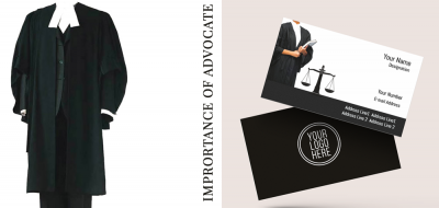
Visiting Card Importance for Advocate
January 19, 2023| Posted in Graphic Design, Visiting card designs, Advocate, Business card Designs, Business card Designs, Visiting card design| Printasia| 2500
The Complete Guide to Designing an Effective Advocate Visiting Card
November 4, 2023

Growing an Advocate Practice: A Guide to Success
January 31, 2023

Visiting Card Importance for Advocate
January 19, 2023
Top Beauty Parlour Visiting Card Designs
June 16, 2025
Gold & Diamond Jewellery Visiting Card Layouts
June 14, 2025
Jewellery Visiting Card Designs That Stand Out
June 12, 2025