Toggle Nav

The Grocery Store Business Card Makeover: Design Trends to Consider

The Grocery Store Business Card Makeover: Design Trends to Consider

In the competitive world of grocery retail, making a memorable impression is crucial for attracting and retaining customers. A well-designed grocery store visiting card can serve as a powerful tool to enhance your store's branding, engage with customers, and create a lasting impact. It's not just a piece of paper; it's a vital aspect of your marketing strategy. In this blog, we'll explore the latest design trends and ideas to give your grocery store visiting card a makeover, ensuring it aligns with your branding and attracts more customers.
The Role of Grocery Store Visiting Cards
Visiting cards for a grocery store hold immense significance in the retail industry. They serve multiple functions and are essential for the following reasons:
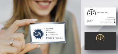
- First Impressions: Your Grocery Store Visiting Cards is often the first physical touchpoint potential customers have with your business. It can set the tone for their perception of your store's professionalism and trustworthiness.
- Memorability: A well-crafted visiting card is more likely to be retained by customers, making it a convenient reference when they need groceries.
- Information Hub: Visiting cards act as a compact repository of critical information, offering customers essential details such as your store's location, contact information, services, and branding.
- Brand Image: The design and content of your visiting card reflect your grocery store's brand image, showcasing your style, values, and commitment to customer satisfaction.
Now, let's dive into the design trends and ideas to consider when giving your grocery store visiting card a makeover:
- Minimalistic Design: Less is More

Minimalism is a timeless design trend that conveys elegance, sophistication, and clarity.
Technique: Use a clean and uncluttered layout with ample white space. Choose simple, easy-to-read fonts, and maintain a limited color palette, preferably featuring your brand colors.
Advice: Minimalistic designs are powerful in conveying professionalism and attention to detail.
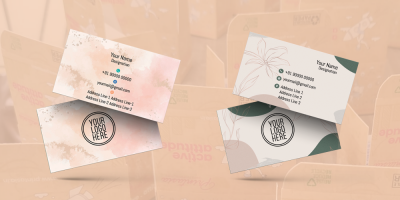
- Nature-Inspired Aesthetics: Fresh and Green
Bringing elements of nature into your visiting card design can create a tranquil and fresh ambiance, reflecting your grocery store's commitment to providing natural and organic products.
Technique: Use natural colors like earthy tones, and incorporate images of leaves, trees, or other natural elements. Experiment with organic textures and patterns.
Advice: Nature-inspired designs emphasize your store's focus on providing fresh and organic produce.
- High-Quality Imagery: Showcase Your Products
In the grocery retail industry, visuals are key. Incorporating high-quality images can give potential customers a visual taste of what your store offers.
Technique: Utilize images of fresh produce, specialty items, in-store scenes, or your store's interior. Ensure that the images are high-resolution, well-composed, and evoke the desired emotions.
Advice: High-quality imagery helps customers visualize the kind of products they can find in your store.
- Sustainable and Eco-Friendly Elements: Green Branding
As sustainability becomes increasingly important, incorporating eco-friendly elements in your visiting card design can highlight your grocery store's commitment to green practices.
Technique: Use eco-friendly materials for the card itself. Include symbols or icons that represent sustainability and eco-conscious practices.
Advice: Sustainability elements reflect your store's eco-friendly initiatives and can appeal to environmentally conscious customers.
- Seasonal Themes and Colors: Freshness and Variety
Highlighting seasonal themes and colors can add a dynamic and engaging element to your visiting card design.
Technique: Adapt your card's design and color palette to match the seasons. Use warm tones for fall, cool blues and whites for winter, vibrant greens for spring, and sunny yellows and blues for summer.
Advice: Seasonal designs demonstrate that your grocery store offers fresh and seasonal produce year-round.
- Typography that Reflects Freshness: Crisp and Clear
Typography plays a significant role in conveying your store's personality and the essence of fresh, quality products.
Technique: Select fonts that resonate with your store's brand. For instance, clean and modern sans-serif fonts can convey a sense of freshness and quality.
Advice: Typography should align with your store's personality, reinforcing brand consistency.
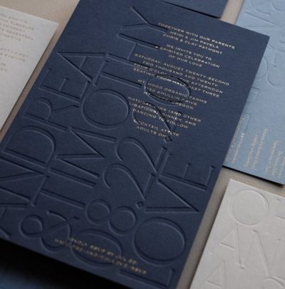
- Texture and Finish: A Tactile Element
Unique finishes can add a tactile and visual dimension to your visiting card, making it more memorable.
Technique: Incorporate unique finishes like embossing, spot UV coating, or letterpress printing. These techniques can enhance the card's overall aesthetic and create a tactile element.
Advice: Unique finishes should complement the card's design and the branding of your grocery store.
- Handwritten Elements: Personal Touch
Including handwritten or script fonts in your card design can add a personal and friendly touch.
Technique: Use handwritten fonts for selected elements, such as your store's slogan, a friendly message, or your store's signature products.
Advice: Handwritten elements create a welcoming and personal atmosphere on your card.
- Local Art or Artisans: Community Connection
Showcasing local art or artisans on your visiting card can emphasize your store's connection to the community.
Technique: Collaborate with local artists to feature their artwork on your card. Include information about the artist and their contact details.
Advice: Featuring local art supports the community and showcases your store's community involvement.
March 28, 2024
|
View: 1221
|
Categories: Graphic Design, Visiting card designs, Business card Designs, Business card Designs, Visiting card design
|
Tags: Visiting card design, Business card, Startup, Creative design, Office Stationery design, Coffee and Cafe Visiting Card, Fruits Supplier Visiting Card, Grocery Shop Visiting Card
|
By: Printasia
|
Modify By: Mitzijoulge at June 14, 2024
About the Author

Related Posts
Flourishing from the centuries now….
December 13, 2022| Posted in Graphic Design, Visiting card designs, Advocate, Business card Designs, astrologer , Insurance Advisor, Business card Designs, Real Estate, Medical Store, Pharmacy , Hardware business, Visiting card design, Dentist, Accountant visiting card, Chartered Accountant visiting card, CMA Visiting card, Eye specialist visiting card, LIC Agent visiting card, Physiotherapist visiting card, Travel Agent visiting card, Physician Doctor visiting card | Printasia| 1211
History of business card
January 5, 2023| Posted in Visiting card designs, Business card Designs, Business card Designs, Visiting card design| Printasia| 1621
How to design a business card
January 5, 2023| Posted in Graphic Design, Visiting card designs, Advocate, Business card Designs, astrologer , Insurance Advisor, Business card Designs, Real Estate, Medical Store, Pharmacy , Hardware business, Dentist, Accountant visiting card, Chartered Accountant visiting card, Company secretary visiting card, CMA Visiting card, Eye specialist visiting card| Printasia| 1164
The latest trend in business card designs
January 6, 2023| Posted in Graphic Design, Visiting card designs, Advocate, Business card Designs, astrologer , Insurance Advisor, Business card Designs, Real Estate, Medical Store, Pharmacy , Hardware business, Visiting card design, Dentist, Accountant visiting card, Chartered Accountant visiting card, Company secretary visiting card, CMA Visiting card, Eye specialist visiting card, LIC Agent visiting card, Physiotherapist visiting card, Travel Agent visiting card, Physician Doctor visiting card | Printasia| 2208

Visiting Card Importance for Advocate
January 19, 2023| Posted in Graphic Design, Visiting card designs, Advocate, Business card Designs, Business card Designs, Visiting card design| Printasia| 2546
The Complete Guide to Designing an Effective Advocate Visiting Card
November 4, 2023

Growing an Advocate Practice: A Guide to Success
January 31, 2023
Top Beauty Parlour Visiting Card Designs
June 16, 2025
Gold & Diamond Jewellery Visiting Card Layouts
June 14, 2025
Jewellery Visiting Card Designs That Stand Out
June 12, 2025