Modern Design Trends for CA Visiting Cards
The Impact of First Impressions: Case Studies of Successful Dentist Visiting Card Designs
In the world of healthcare, creating a strong and positive first impression is paramount. For dental professionals, the importance of establishing trust and credibility with patients cannot be overstated. The dentist's visiting card, often an initial point of contact, plays a vital role in shaping these impressions. In this blog, we will explore the impact of first impressions through case studies of successful dentist visiting card designs, highlighting how these designs have contributed to the success of dental practices.
The Role of the Dentist's Visiting Card
A dentist's visiting card is more than just a piece of paper with contact information. It serves as a critical representation of the dental practice's professionalism, expertise, and commitment to patient care. A well-designed visiting card is significant for several reasons:
- First Impressions: The card is frequently the first physical interaction patients have with a dental practice, shaping their initial perception of the clinic and its practitioners.
- Professionalism: An effective design conveys professionalism and instils confidence in the quality of care that patients can expect.
- Memorability: A memorable and well-designed card is more likely to be kept by patients, helping them recall and revisit the dental practice.
- Trust Building: Through its design, content, and aesthetics, the visiting card can convey trustworthiness, expertise, and a dedication to patient comfort and well-being.
- Brand Identity: It serves as an extension of the dental practice's brand identity, representing the clinic's personality, values, and commitment to excellence.
Now, let's delve into case studies of successful dentist visiting card designs, each demonstrating the profound impact of first impressions in the dental industry:
Case Study 1: Modern Minimalism for a Cutting-Edge Dental Practice
Clinic: "The Smile Studio"
The "Smile Studio" is a state-of-the-art dental practice that focuses on cosmetic dentistry, offering services like teeth whitening, veneers, and smile makeovers. To convey their commitment to modernity and cutting-edge technology, they opted for a minimalist dentist visiting card design.
Key Elements of the Design:
- Clean and Minimalist Design: The card features a clean, minimalist design with a predominantly white background and the clinic's logo at the top.
- High-Quality Imagery: The card showcases high-quality images of their modern clinic and advanced dental equipment. A photograph of a patient with a radiant smile adds a personal touch.
- Sleek Typography: Sleek and professional typography was used to maintain a contemporary and minimalistic look.
Impact on the Clinic:
The modern minimalist design aligns with the clinic's focus on cosmetic dentistry and high-tech solutions. The clean and uncluttered card conveys a sense of precision and expertise, creating a memorable first impression. Patients perceive "The Smile Studio" as a cutting-edge clinic that prioritizes both aesthetics and advanced dental technologies.
Case Study 2: Traditional Elegance for a Family-Friendly Dental Practice
Clinic: "Heritage Dental Care"
"Heritage Dental Care" is a dental practice that specializes in family dentistry, providing services for patients of all ages. The clinic wanted to communicate a sense of trust, tradition, and family-friendly care through their visiting card design.
Key Elements of the Design:
- Warm Color Palette: The card incorporates a warm color palette with earthy tones and a vintage-inspired background.
- Classic Logo: The clinic's logo is a classic design, featuring a tree with interconnected roots and leaves to symbolize family and heritage.
- Classic Serif Typography: Classic serif fonts were chosen to evoke a sense of tradition and timeless values.
Impact on the Clinic:
The traditional elegance in the visiting card design resonates with the clinic's target audience – families and patients seeking a warm, trustworthy, and family-oriented dental care experience. The design creates an immediate impression of a dental practice that values heritage and the well-being of its patients.
Case Study 3: Pediatric Playfulness for a Child-Centered Dental Practice
Clinic: "Kids' Dental Haven"
"Kids' Dental Haven" is a specialized dental practice dedicated to pediatric dentistry. They aim to create a welcoming and playful atmosphere for children. Their visiting card design is a testament to this commitment.
Key Elements of the Design:
- Colorful Palette: The card employs a bright and colorful palette featuring primary colors, reminiscent of a playful and child-friendly environment.
- Cartoon Mascot: The clinic's cartoon mascot, a friendly tooth character, is prominently displayed on the card.
- Child-Friendly Fonts: Fun and child-friendly fonts were used to make the card approachable to young patients.
Impact on the Clinic:
The pediatric playfulness reflected in the visiting card design is perfectly aligned with the clinic's mission of providing a child-centred dental experience. It creates a memorable and inviting first impression, reassuring parents and children that "Kids' Dental Haven" is the ideal place for pediatric dentistry.
Case Study 4: High-End Luxury for Cosmetic Dentistry
Clinic: "Smiles of Beverly Hills"
"Smiles of Beverly Hills" is a high-end dental practice specializing in cosmetic dentistry, catering to clients who value luxury and aesthetic enhancements. Their dentist visiting card design oozes opulence.
Key Elements of the Design:
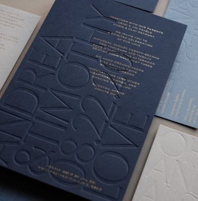
- Luxurious Color Scheme: The card features a luxurious color scheme with gold and deep blue, conveying opulence and luxury.
- Gilded Accents: Gilded edges and embossed gold foil accents give the card a touch of extravagance.
- High-Quality Paper: The card is printed on thick, premium-quality paper with a velvety texture.
Impact on the Clinic:
The high-end luxury design of the visiting card perfectly aligns with the clinic's positioning in the cosmetic dentistry market. It creates an immediate impression of opulence and exclusivity, attracting clients who value luxury and aesthetics. The card reinforces the clinic's commitment to providing top-tier cosmetic dental services.
Case Study 5: Personalized Touch for a Boutique Dental Practice
Clinic: "Graceful Smiles Boutique Dentistry"
"Graceful Smiles Boutique Dentistry" is a boutique dental practice known for its personalized and patient-centered approach
