Toggle Nav

Dos and Don'ts: Common Mistakes to Avoid in Dentist Visiting Card Design

Dos and Don'ts: Common Mistakes to Avoid in Dentist Visiting Card Design

In the realm of healthcare, building trust and credibility is paramount. Dentists are no exception to this rule. A well-designed dentist visiting card can serve as a powerful tool for creating a positive impression and instilling confidence in patients. However, like any design endeavor, there are pitfalls to avoid. In this blog, we will explore the dos and don'ts of dentist visiting card design, highlighting common mistakes that should be avoided to ensure your business card effectively represents your dental practice.
The Significance of a Dentist's Visiting Card
A dentist's visiting card, also known as a business card, is more than just a piece of paper with contact information. It serves as an ambassador for your practice, conveying your professionalism, trustworthiness, and commitment to patient well-being. Here's why a dentist's visiting card is significant:
- First Impressions: It is often the first tangible interaction patients have with your practice, shaping their initial impression.
- Professionalism: A well-designed card conveys professionalism, indicating that you're a reliable healthcare provider.
- Memorability: A memorable and well-designed card is more likely to be kept by patients, helping them remember your services and return for dental care.
- Trust Building: Through its design, content, and aesthetics, your card can convey trustworthiness, expertise, and a commitment to patient comfort.
- Brand Identity: It should be an extension of your practice's brand identity, representing your clinic's personality and values.

Now, let's dive into the dos and don'ts of dentist visiting card design:
Dos: Design Best Practices
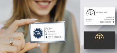
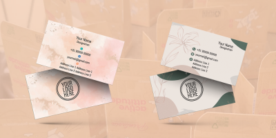
- Professional Branding and Logo Integration
Do: Incorporate your dental clinic's logo and branding elements. These visual cues serve to create immediate brand recognition.
Why: Professional branding and a well-designed logo help build trust and professionalism, making your practice instantly recognizable.
- High-Quality Imagery
Do: Include high-quality images of your clinic, dental equipment, or a friendly image of yourself. High-resolution photos create an impression of authenticity.
Why: High-quality images reinforce the perception of a modern, clean, and trustworthy dental practice. Patients appreciate seeing your clinic environment and the equipment they will encounter.
- Clear and Readable Typography
Do: Use clear and easy-to-read fonts. The typography should be legible, ensuring that patients can access your contact information without any difficulties.
Why: Readable typography is essential as patients may need to refer to your card when making an appointment or contacting your clinic. A legible card is an effective one.
- Professional Credentials and Certification

Do: Feature your full name along with your professional credentials and certifications. It's essential to communicate your qualifications.
Why: Patients seek assurance that they are receiving care from a qualified dental professional. Including your credentials establishes trust and highlights your expertise.
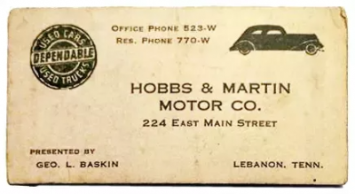
- Contact Information
Do: Include clear and accessible contact information. Provide your phone number, email address, and office address, making it easy for patients to reach out to you.
Why: Patients need a convenient way to contact your clinic for appointments or inquiries. Ensure that your contact information is accurate and up-to-date.
- Personal Statement or Clinic Philosophy
Do: Consider including a brief personal statement or a statement reflecting your clinic's philosophy. This can resonate with patients and communicate your commitment to patient comfort and care.
Why: A personal statement or clinic philosophy adds a personal touch and provides insight into your approach to patient care.
- Office Hours and Appointment Booking Information
Do: Clearly mention your office hours and provide information on how patients can schedule appointments. Be specific about appointment booking methods.
Why: Patients want to know when your clinic is open and how they can schedule appointments. Make it easy for them to access your services.
- Specializations and Services Offered

Do: Highlight your dental specializations and the services your clinic provides. This helps patients quickly understand the scope of your practice.
Why: Patients appreciate knowing your areas of specialization and the services you offer. It helps them determine if your clinic can meet their specific needs.
- Testimonials and Awards
Do: If available, showcase positive patient testimonials or any awards and recognitions your clinic has received. These add credibility and reinforce the quality of your services.
Why: Patient testimonials and awards serve as social proof, assuring potential patients that they will receive quality care at your clinic.
- Modern Design Elements
Do: Incorporate modern design elements that reflect a contemporary and patient-focused practice.
Why: Modern design conveys your commitment to staying current in the dental field and creating a welcoming and comfortable atmosphere for patients.
Don'ts: Common Mistakes to Avoid
- Overcrowding with Information
Don't: Avoid overcrowding the visiting card with excessive information, such as lengthy descriptions or too many services.
Why: An overcrowded card can overwhelm patients and make it difficult to locate essential information quickly. A cluttered card can be ineffective and unappealing.
- Poor Image Quality

Don't: Use low-resolution or poor-quality images on your card.
Why: Low-quality images can make your card appear unprofessional and compromise the perception of your clinic's standards. Patients want to see crisp, clear visuals.
- Overly Ornate Fonts
Don't: Steer clear of overly decorative or complex fonts that may be challenging to read.
Why: Ornate fonts can hinder readability and frustrate patients who need to access your contact information or services quickly.
- Inconsistent Branding
Don't: Inconsistent branding elements or the absence of a logo can create confusion.
Why: Consistency in branding fosters recognition. A lack of branding elements can diminish the professional identity of your clinic.
- Lack of Clarity in Typography
Don't: Avoid using fonts that lack clarity or legibility. Patients should be able to read the card without strain.
Why: Unclear typography can lead to misunderstandings and create a negative impression. Patients
November 14, 2023
|
View: 968
|
Categories: Graphic Design, Visiting card designs, Business card Designs, Business card Designs, Visiting card design, Dentist
|
Tags: Visiting card design, Business card, Startup, Creative design, Office Stationery design
|
By: Printasia
|
Modify By: Mitzijoulge at July 1, 2024
About the Author

Related Posts
Flourishing from the centuries now….
December 13, 2022| Posted in Graphic Design, Visiting card designs, Advocate, Business card Designs, astrologer , Insurance Advisor, Business card Designs, Real Estate, Medical Store, Pharmacy , Hardware business, Visiting card design, Dentist, Accountant visiting card, Chartered Accountant visiting card, CMA Visiting card, Eye specialist visiting card, LIC Agent visiting card, Physiotherapist visiting card, Travel Agent visiting card, Physician Doctor visiting card | Printasia| 1197
History of business card
January 5, 2023| Posted in Visiting card designs, Business card Designs, Business card Designs, Visiting card design| Printasia| 1605
How to design a business card
January 5, 2023| Posted in Graphic Design, Visiting card designs, Advocate, Business card Designs, astrologer , Insurance Advisor, Business card Designs, Real Estate, Medical Store, Pharmacy , Hardware business, Dentist, Accountant visiting card, Chartered Accountant visiting card, Company secretary visiting card, CMA Visiting card, Eye specialist visiting card| Printasia| 1156
The latest trend in business card designs
January 6, 2023| Posted in Graphic Design, Visiting card designs, Advocate, Business card Designs, astrologer , Insurance Advisor, Business card Designs, Real Estate, Medical Store, Pharmacy , Hardware business, Visiting card design, Dentist, Accountant visiting card, Chartered Accountant visiting card, Company secretary visiting card, CMA Visiting card, Eye specialist visiting card, LIC Agent visiting card, Physiotherapist visiting card, Travel Agent visiting card, Physician Doctor visiting card | Printasia| 2184

Visiting Card Importance for Advocate
January 19, 2023| Posted in Graphic Design, Visiting card designs, Advocate, Business card Designs, Business card Designs, Visiting card design| Printasia| 2527
The Complete Guide to Designing an Effective Advocate Visiting Card
November 4, 2023

Growing an Advocate Practice: A Guide to Success
January 31, 2023

Visiting Card Importance for Advocate
January 19, 2023
Top Beauty Parlour Visiting Card Designs
June 16, 2025
Gold & Diamond Jewellery Visiting Card Layouts
June 14, 2025
Jewellery Visiting Card Designs That Stand Out
June 12, 2025